
Wine Label Embossing: How to Get the Best Results
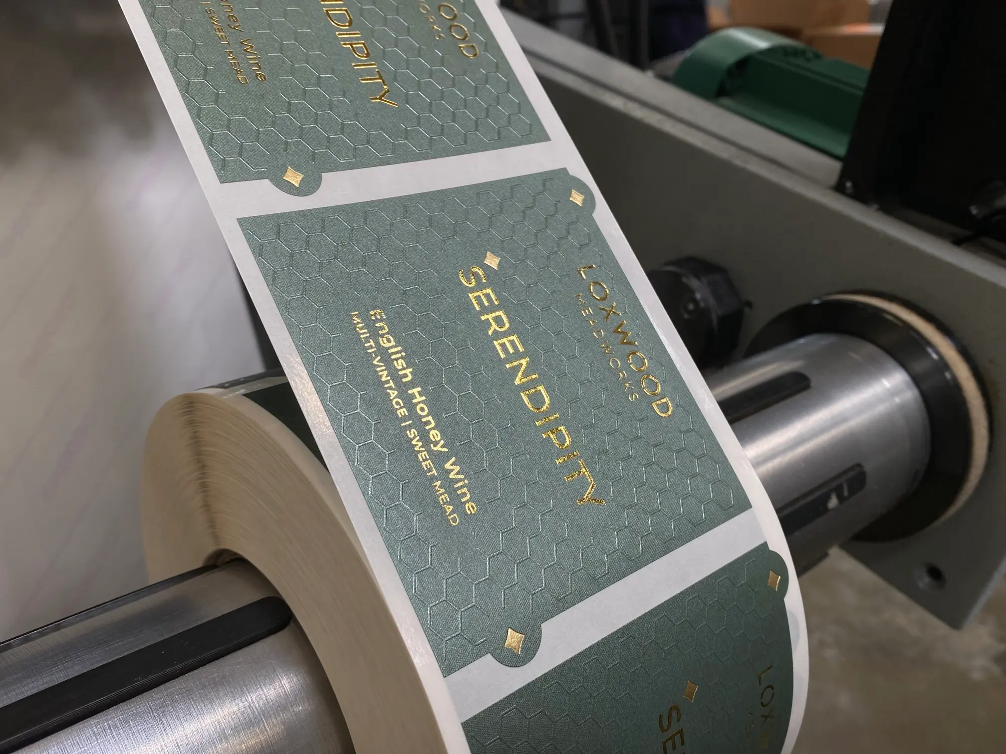
Embossing is considered the premium quality method to add texture and a premium feel to wine labels. Combined with foiling, it can make a logo, border, illustration or key detail really stand out from the label surface.
But achieving a good embossed finish starts with the artwork. Wine label embossing is not simply about choosing how raised you want the design to be; the amount of detail in the artwork can affect how successfully the final profile can be achieved.
How does embossing work?
“Embossing is used to highlight an image or text area, adding a visible raised texture and tactile features.”
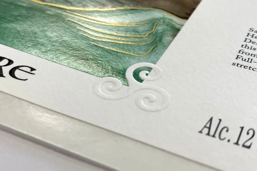
Embossing creates a raised effect, done by pressing the label material between specially made tooling. The artwork is transferred into the material, creating a tactile finish that you can see and feel. Debossing is the process in reverse whereby the print is ‘sunk’ into the substrate surface. The term ‘blind embossing’ is used when embossing unprinted label areas with texts or logos.
The depth of an emboss depends on several factors, including the label material and the detail within the artwork. This is where artwork preparation becomes particularly important.
Why does fine detail matter?
It is important to note , that there are physical limits to the embossing of fine artwork details.
As a general guide, we aim for a minimum embossing height of around 0.35 mm, with embossing details ideally at least 0.8 mm thick to achieve this. These figures are a useful guide rather than a guarantee, as the thickness and characteristics of the label material also influence the final result.
Combining embossing with foil
Embossing can be used on its own, but it also pairs very well with hot foil. This can be done through a process called fluting. Fluting is a finishing technique that applies both foil and embossing to a label in a single machine pass by a combination die. This ensures the foiled and embossed elements are perfectly aligned, creating a precise combination of shine, depth and texture.
Foil adds colour, shine and contrast, while embossing adds physical depth. Used together, they can create a striking finish for wine labels, particularly where you want to highlight a brand name, crest, logo or decorative detail.
Good wine label embossing should feel deliberate rather than simply adding as much depth as possible. The aim is to create a finish that works with the artwork, label material and other embellishments.

What happens if your artwork is too fine?
Fine artwork might need some adjusting but we can help you with that and achieve the best possible result.
For example, some elements of a logo may need to be slightly thickened or simplified. This can allow the embossing to reproduce more consistently while retaining the overall look and character of the original artwork.
How to prepare your artwork
If you are planning an embossed label, there are a few things to keep in mind:
- Consider the thickness of fine lines and small details.
- Supply artwork as an editable, high-resolution PDF.
- Allow enough time for us to review the artwork before production and amend if required.
Our in-house design team can review your artwork and, where necessary, thicken or adjust fine details to make them more suitable for embossing.
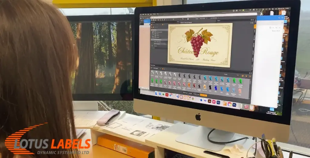
Supplying an editable PDF means our design team can make these amendments where needed, rather than having to recreate the artwork from scratch.
Embossing is a great way to give a wine label an added sense of quality and craftsmanship. Getting the artwork right at the beginning helps ensure the finished result will look as intended.
If you are considering adding embellishments to your labels, send us your artwork and let our knowledgeable team come up with ideas. We can advise on what is achievable and help you create a finish that brings your design to life.
