Five product label styles that will make your products fly off the shelves
When it comes to selling your products, the packaging can often make or break the deal.
If your product’s label looks cheap and unprofessional, consumers are less likely to trust that the product itself will be of high quality. However, if you design a clean, appealing label with the right elements, you can make your product stand out amongst its competitors and attract more customers to make purchases. In fact, it’s been estimated that a company could increase its profits by as much as 20% just through well-designed labels.
Here are five label design features that will help your products fly off the shelves.
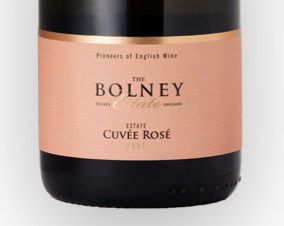
1) The charm of a vintage style label
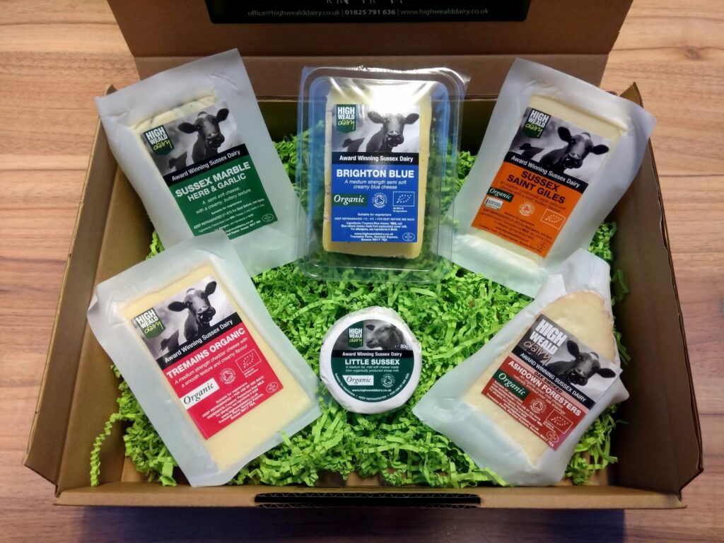
Classic, simple design can be more than just aesthetically pleasing—it can also inspire confidence. Consider some popular products: traditional, classic flavors like strawberry jam or jelly, for example. When you see a pretty package, you’re already thinking about how great it will taste on your morning toast. In fact, many companies have confirmed that beautiful labels increase trust in their brand and result in more sales. The takeaway? Simplicity is key. Strip away anything that isn’t necessary to communicate what makes your product unique. Pare down font choice to an easily readable serif or sans-serif typeface. Use clean lines and eye-catching colors.
2) The beauty of simplicity
If you want to make a product sell, then the first thing you need to do is create a brand.
Defining a brand is more than just coming up with a name and logo – it’s also making sure that everything else associated with your company, the packaging, the website, the imagery and is consistent and recognisable in style. Of course, creating an appealing label can be one of the most time-consuming efforts in getting your brand recognised and onto store shelves, but if you take the time to find out what appeals to customers on an emotional level – be it color palettes or other themes – you’ll have better luck hitting it off with them from day one.
3) The magic of typography
When it comes to typography, the words on the package are often more important than the image. There are a lot of different factors that go into making good typography: Should the font be loud or quiet? Formal or informal? How should letters be spaced and what makes an attractive typeface? What’s the right amount of text on a label? Should it say everything there is to know about your product or just what customers need to know? The typeface you choose and how you use it all plays into how much customers will like your product. Take time choosing your fonts and checking their legibility; after all, no one likes squinting at tiny print!
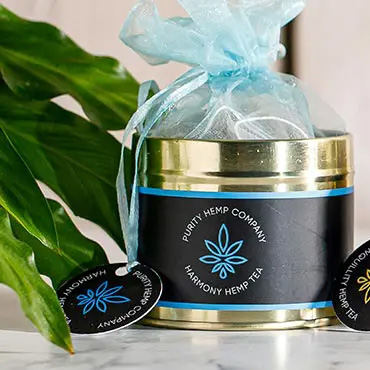
4) The freshness of colours
Colour is another crucial factor when it comes to grabbing consumers’ attention. Keep it fresh and vibrant; your labels should not appear dull or washed-out.
Look at the big brands Kelloggs, Coca-Cola, Cadbury’s, Heinz and L’Oreal: they all use bright, eye-catching colours that make their product labels or packaging stand out. On the other hand, being too aggressive with colour can be too much of a good thing – it is not advised to pair more than three colours on one label; otherwise, you might end up with an eye-straining mishmash of design elements that don’t look appealing at all.
People need to be able to look at your product label and instantly know what it contains without having to read the details.
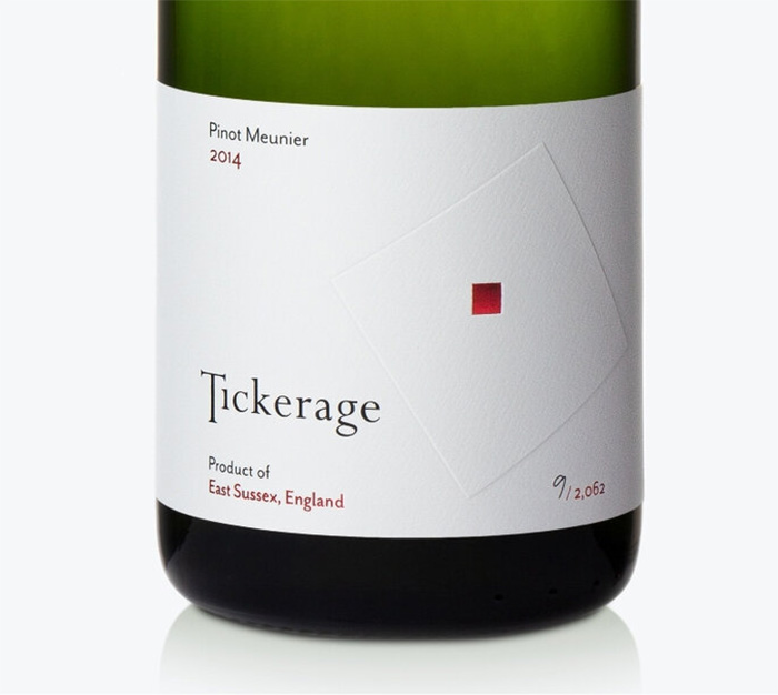
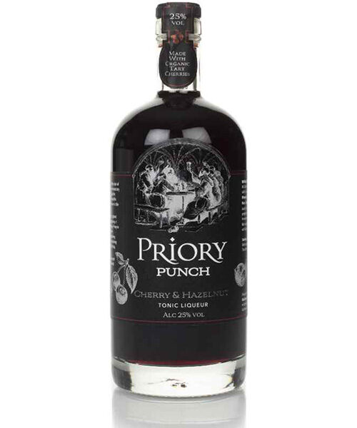
5) The charm of monochrome
A recent study shows that the touch of monochrome can have a significant impact on decision making. Experiments test whether people could be subconsciously influenced by colour schemes before making a purchase. This is specifically important before launching a new brand, when consumer panel testing often includes a colourful and a black and white (monochrome) versions of similar packaging.
Bright colours often lead the way, yet consumers consider the product to have an air of luxury or sophistication and a higher price tag when presented in black and white. In short, luxury sells. This holds true for most product packaging: A monochrome theme might help your products fly off store shelves more readily.
Contact Us
1 Park View, Alder Close,
Eastbourne, BN23 6QE,
East Sussex, UK
© 2026 Lotus Labels.
Web Design by Kintoweb